

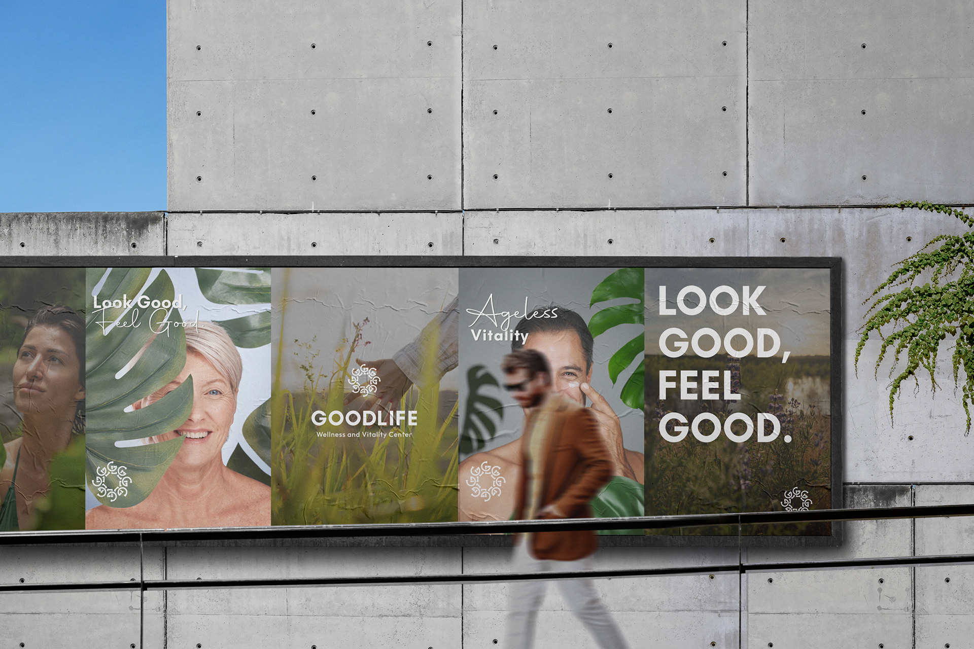
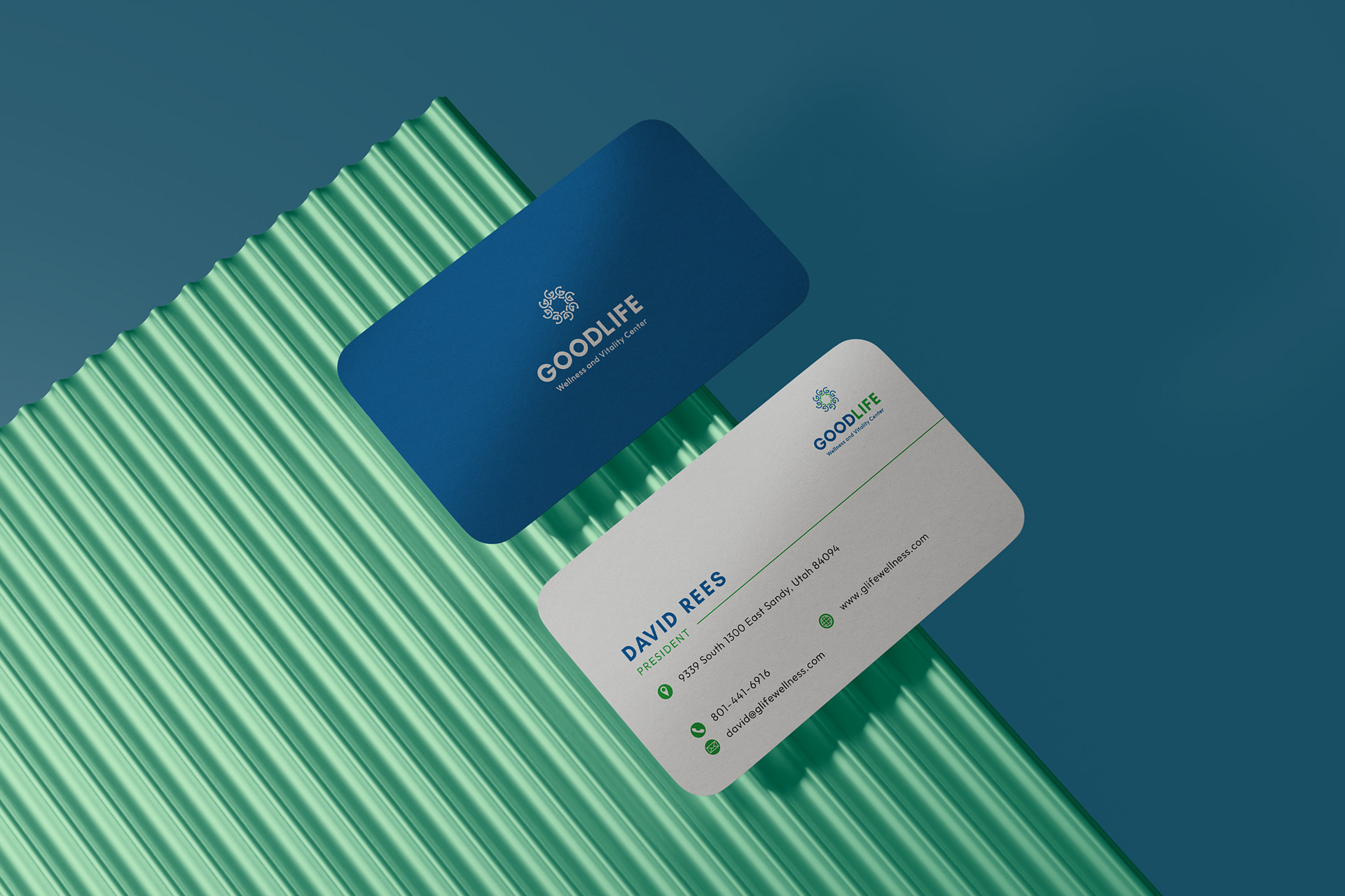
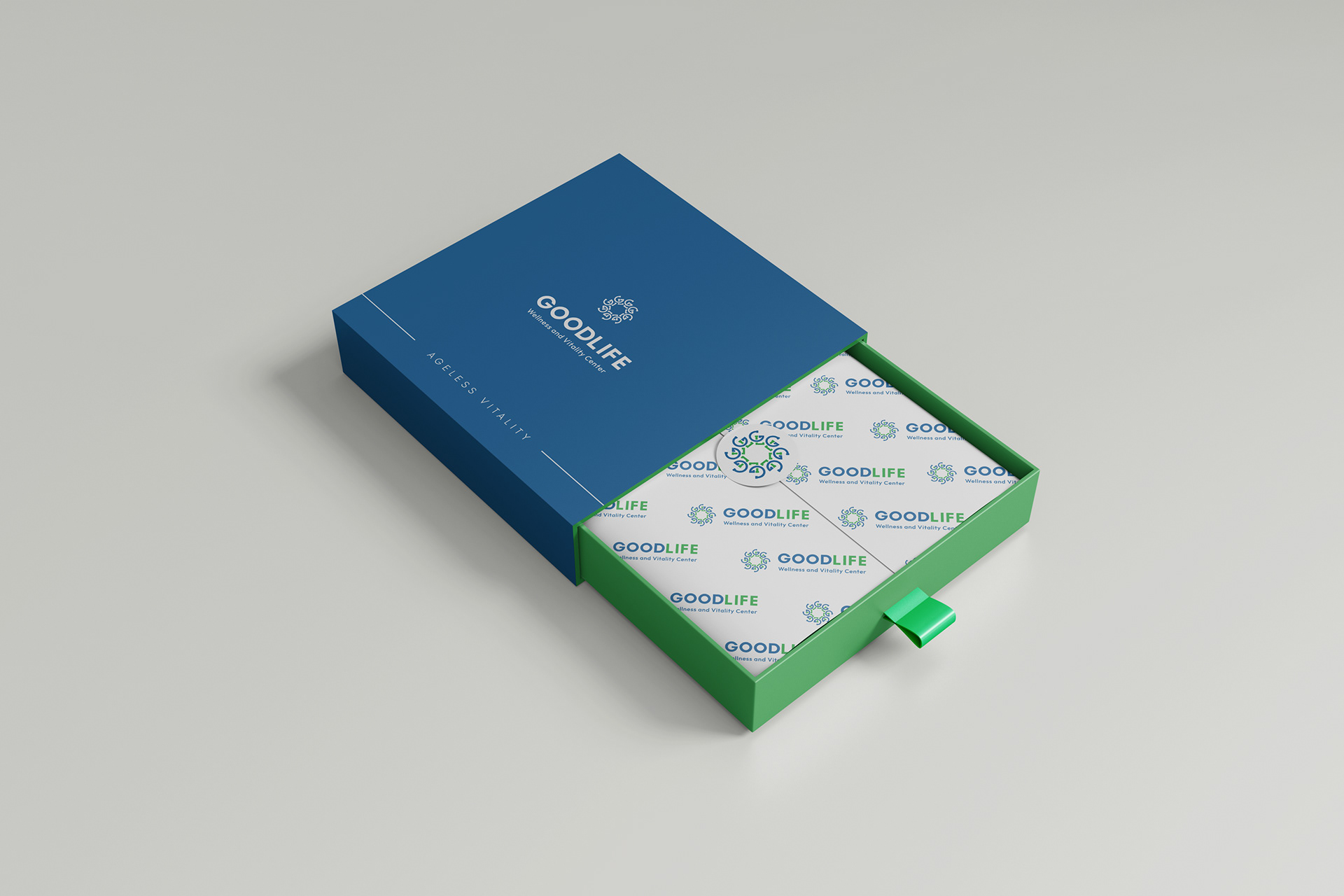
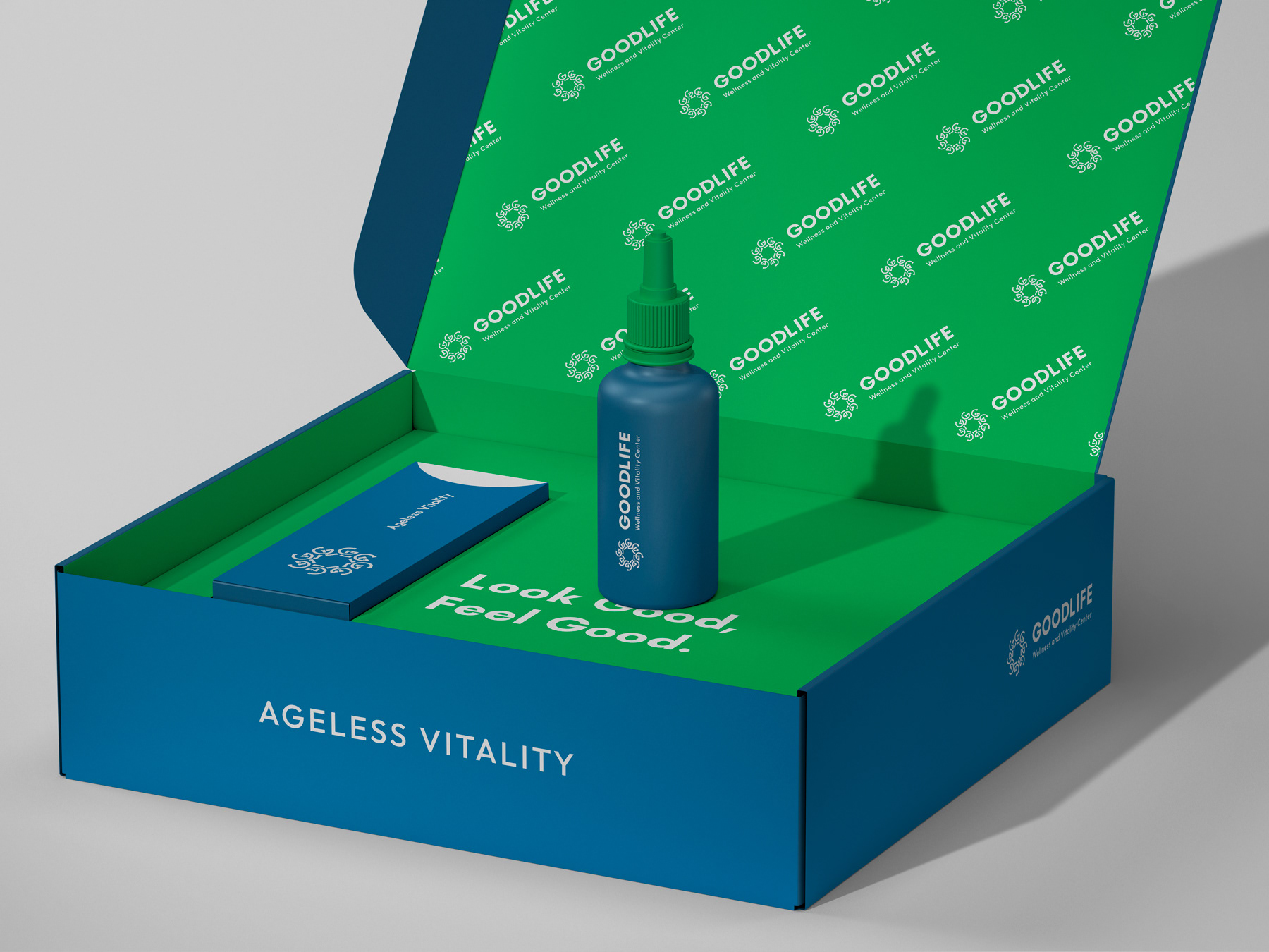
Captures the essence of circle of life, embracing its imperfections and offering a guiding balance. The logomark of GOODLIFE is intentionally designed with slight misalignment, symbolizing the ups and downs of life—and GOODLIFE is there to make a balance. The carefully chosen color palette and organic forms reflect natural, wellness, and vitality reinforcing the message that Goodlife is a trusted partner in finding harmony.
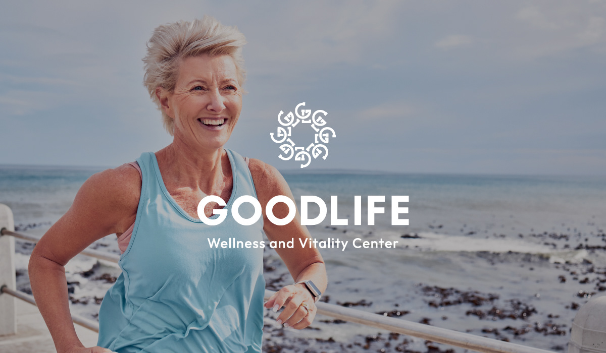

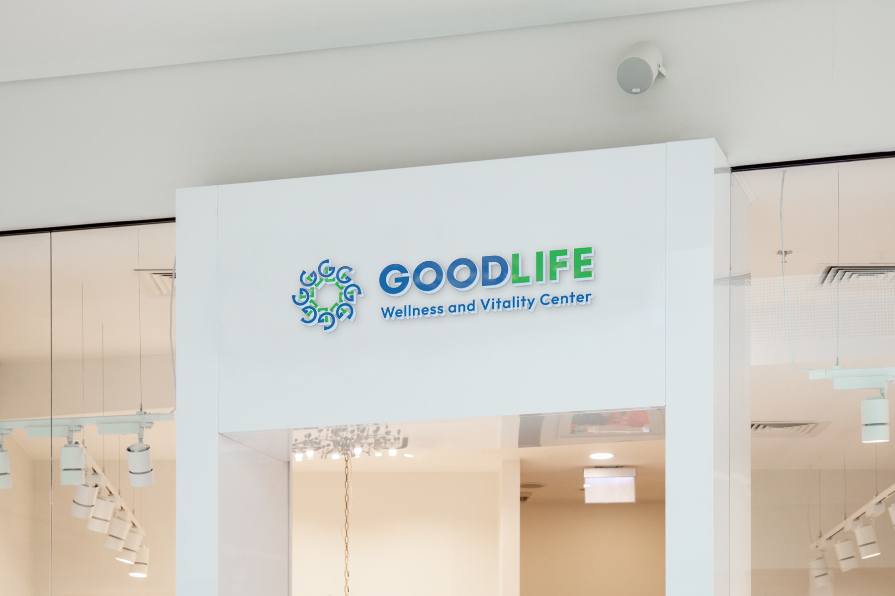
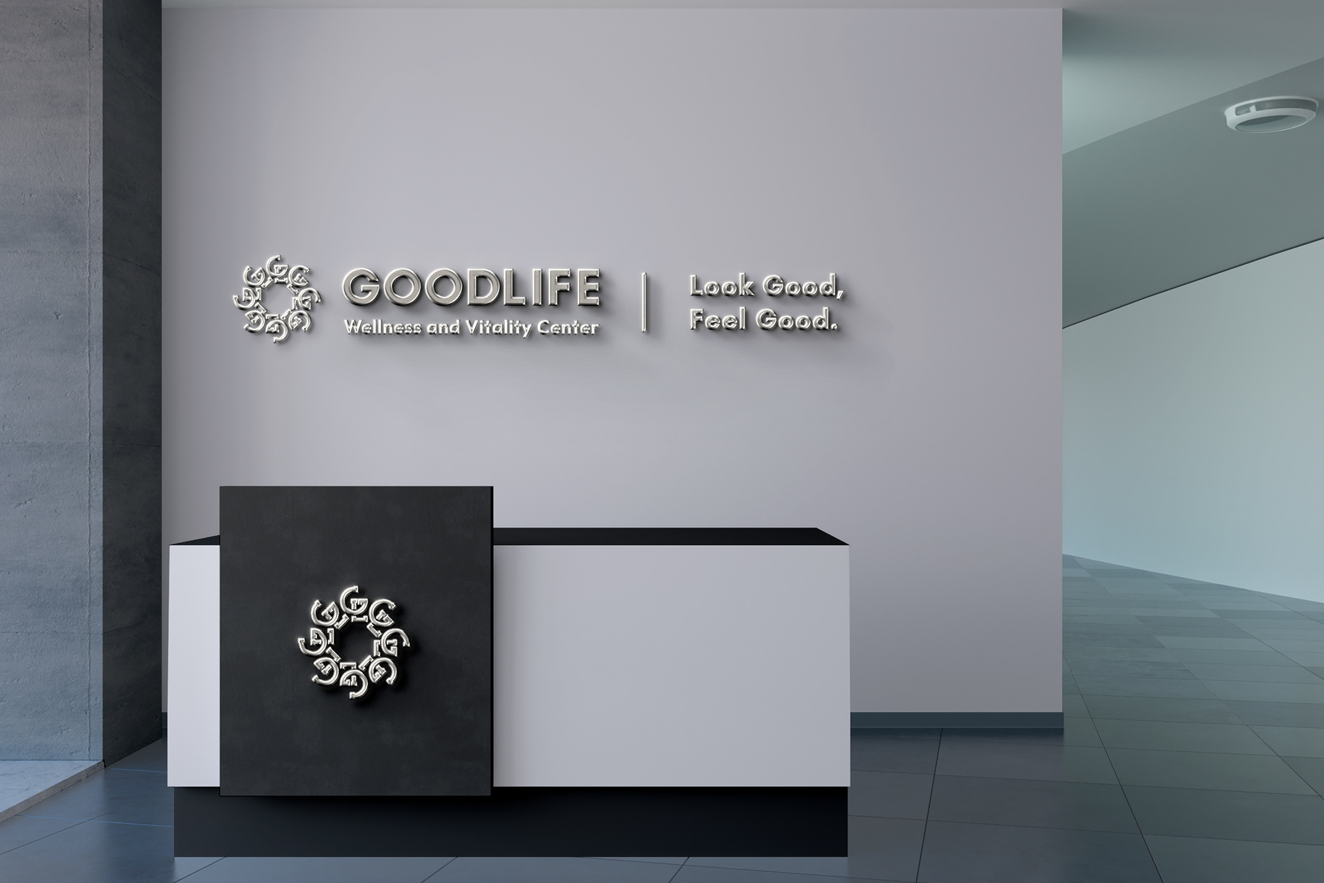
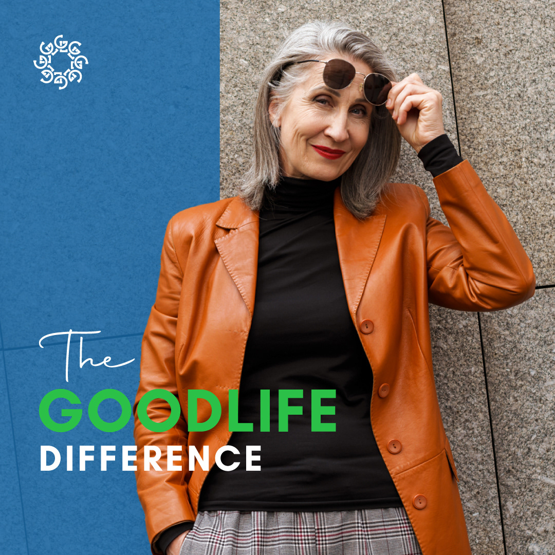
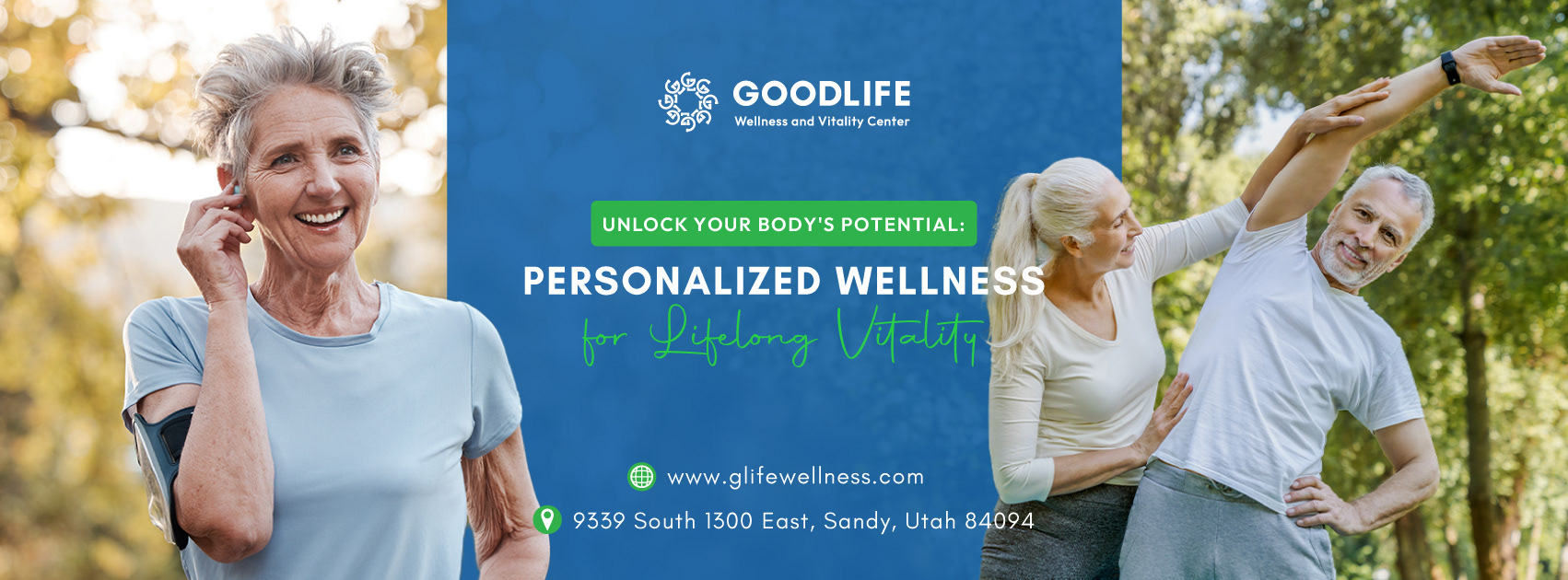
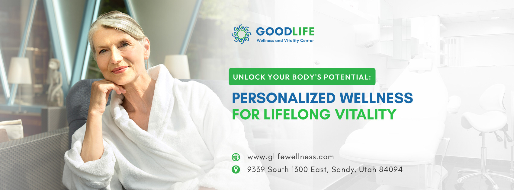
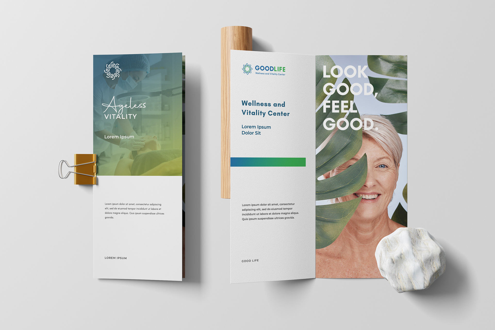
GOODLIFE Wellness and Vitality Center is a client of Let's B Media. I handled the account to design the Logo Design/ Brand Identity. Collaboratively, we crafted an impactful approach that effectively represents the company's mission and vision.