


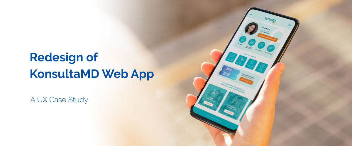
**** This case study pertains to a project undertaken at De La Salle College of Saint Benilde-SPaCE as part of my Diploma in UI/UX Web Design & Development, intended solely for academic study purposes.
Overview
KonsultaMD is a telemedicine service that provides 24/7 access to licensed doctors to address patients general and mental health concerns with no appointment needed. Patients are able to consult a doctor via chat, voice or video call from the comfort of their homes. Patients may also book online appointments to consult with specialist doctors.
Problem
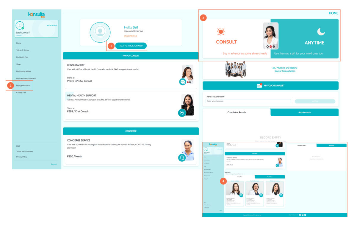
The four services offered by KonsultaMD are scattered across their current dashboard. This current layout is confusing and does not effectively guide users where to access each service.
- Video/Call Consultation
- Book Doctor Appointments
- Vouchers
- Health Plans
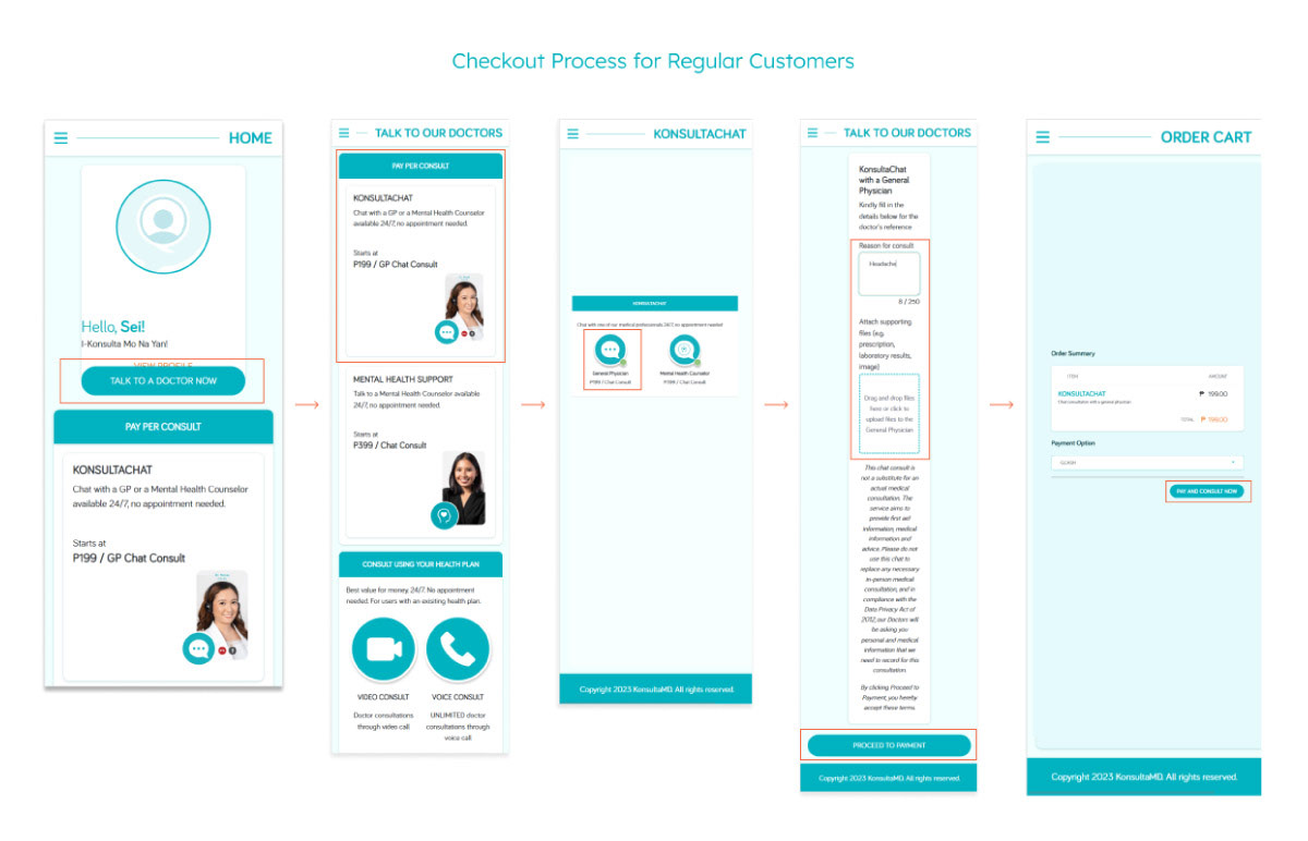
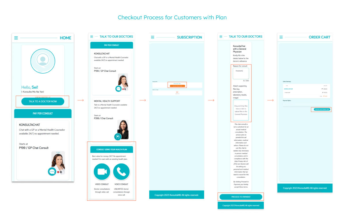
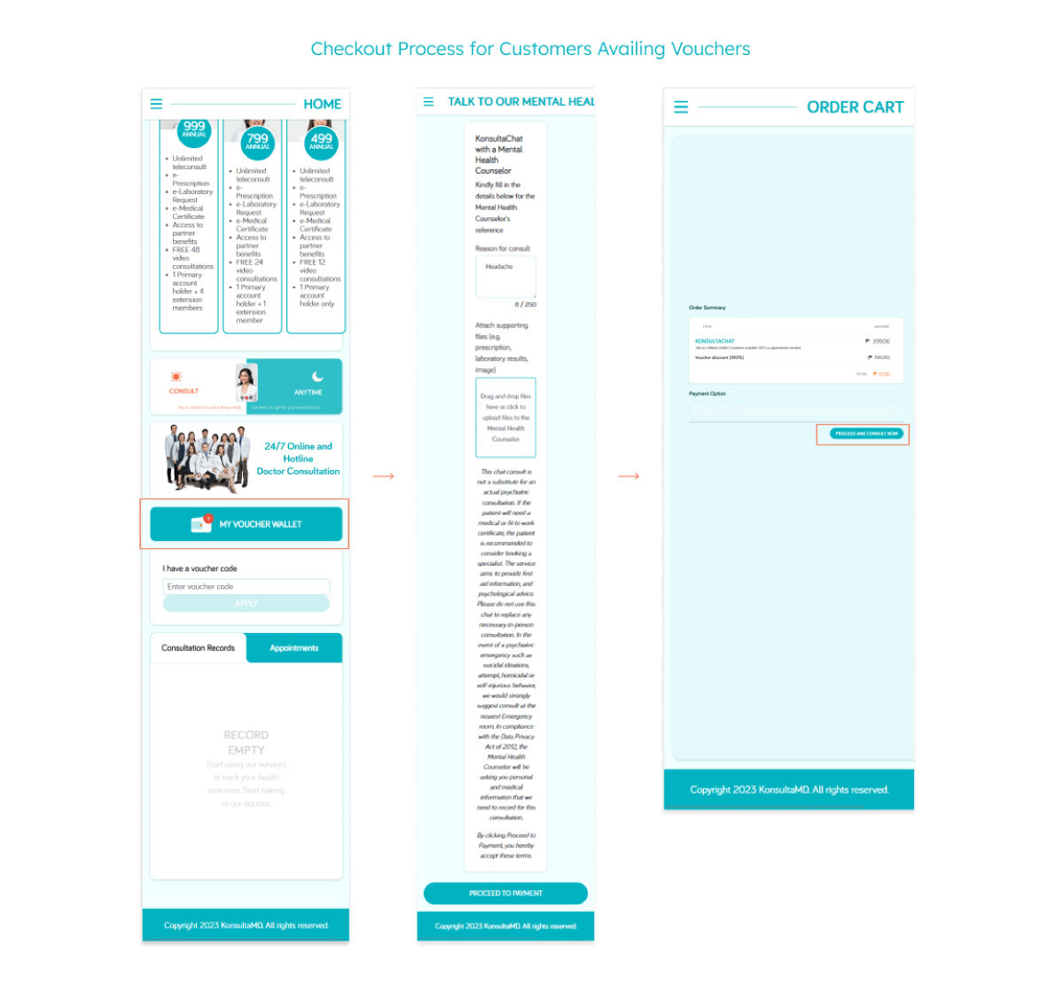
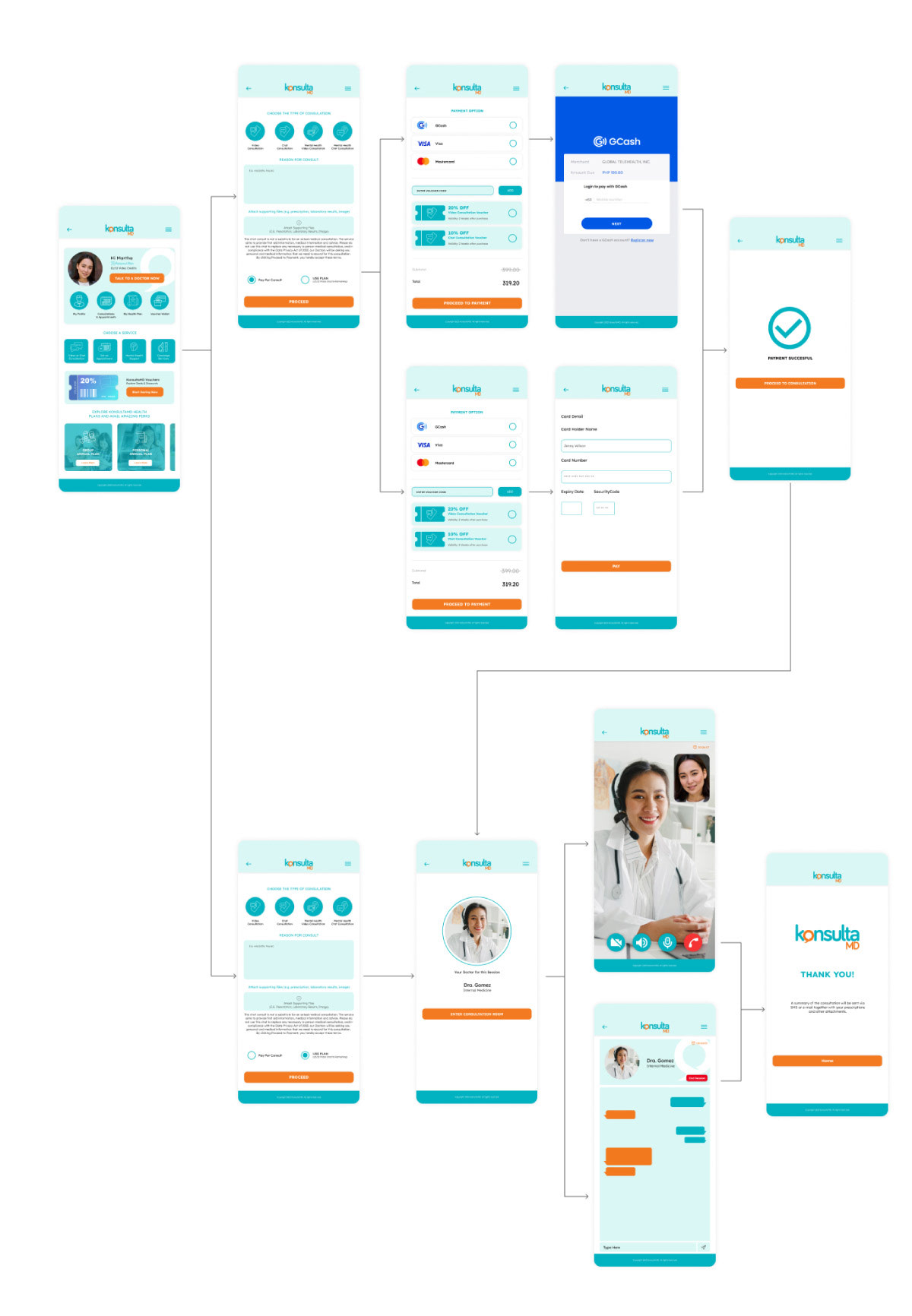
There are currently three separate checkout process when purchasing video or chat consultations. Each process takes too many steps/pages. The process is also inconvenient for customers with health plans and vouchers.
Solution
- Improve the dashboard layout to make the features easier to access.
- Add icons to give users better visual cues.
- Make the checkout process more convenient for both regular customers and customers with plans.
- Include voucher redemption during the checkout process.
User and Audience
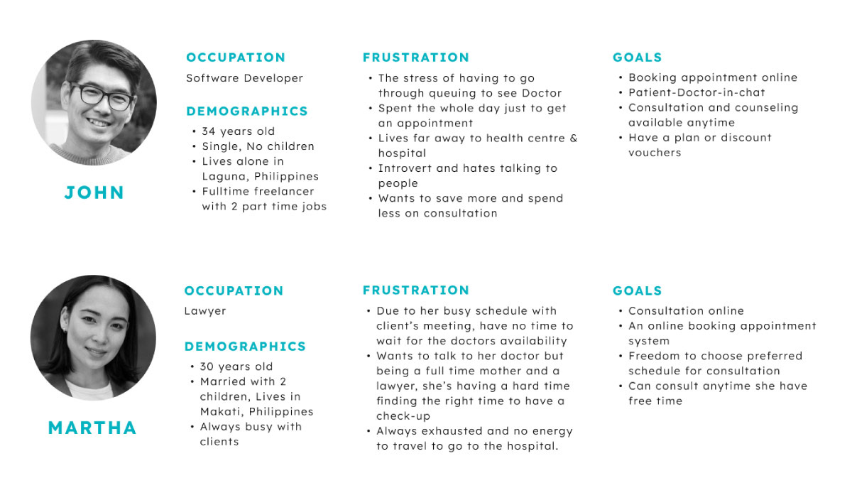
With sufficient user research obtained, we began crafting our personas. We believe that understanding the intricacies of the persona details helps make every decision more personal.
Roles and Responsibilities
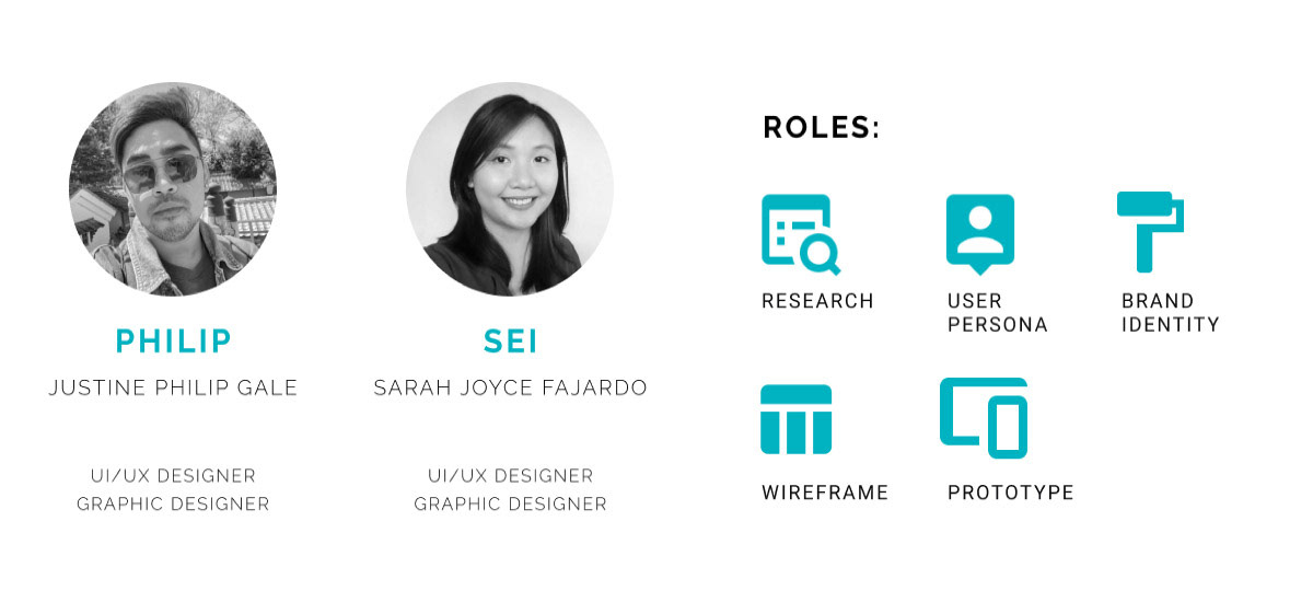
With the same goals in mind, Sarah and I worked on this case study. As part of our collaboration, we conducted in-depth research on user experience to gain a comprehensive understanding of user behavior. We created this case study to simplify the UI and user experience to make an impactful, streamlined and intuitive design that will make the experience with ease. Despite working within a specific timeframe, we are able to address and find solution for the problem stated above.
Scope of Work and Constraints
With the given timeframe of 2 weeks, our scope includes:
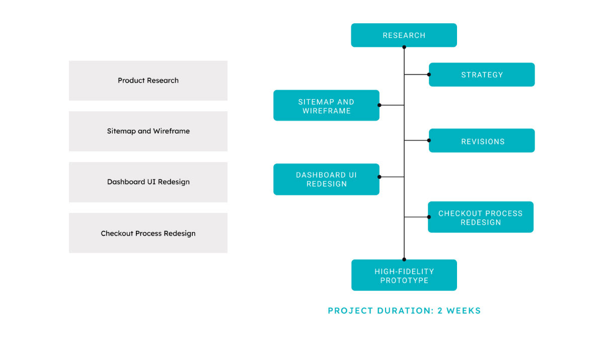
Sitemap

High Fidelity Prototype
Web App Homepage

Mobile Web App
Conclusion
We have successfully designed a dashboard that is easier for users to navigate and use. All the features and services that Konsulta.MD offers can now be easily explored by the users the moment they entered their dashboard.
And lastly, we were able to simplify Konsulta.MD’s checkout process. We managed to combine their three separate and confusing checkout processes into one streamlined process with less steps and pages.